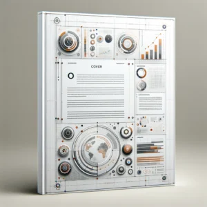
Lets’ talk about technical Report Cover Pages! We, humans, are much better at grabbing information that is visual than the written text. You know, it doesn’t matter whether your report is graphical or you’ve covered all the topics unless you have not made an engaging report cover that briefs about your content.
Choose Colors Sensibly for Your Cover Pages
Be smart when you choose the colors and don’t include all the colors or many different colors to create a wrong impression on the viewer. Bold colors should be used, and make sure you use highlight color with the command.
You can change shades and tints but don’t use many colors, which distract the message you’re trying to deliver. Sticking with a single highlight color would help a lot and would seize the reader’s attention.
Don’t rush with font selection
Many of us get confused between text size to choose from and whatnot. As many of the options are available and we tend to make our content readable, selecting the correct font plays a considerable part. It is recommended not to use more than three fonts in one document, which tells the readers what to read first.
The report should have a header, sub-header, and paragraph text. The header should be bolder and styled to grasp the reader’s attention. The sub header should be less styled than the title. And lastly, the paragraph text should be readable and no styling is needed in this part.
Choose Attention-Grabbing Visuals
There are a few characteristics to remember when choosing visuals for your cover page. It can be data-based or a picture, the highest the quality of the visual part, the better. Besides quality images, choose photographs that are relevant to the content. It should be simple yet unique; this makes the cover page appealing.
Prepare the Cover Page’s Hierarchy
The design’s hierarchy is the organization in which the content lays to guide a viewer through the image. What should a reader notice first and second and so on? The template should be eye-catching before anything else on the image, as extensive texts and subtitles are not the only ones for achieving a solid hierarchy. Keep the cover page simple; do not overflow it with the texts, colors, and other things because it’s only an idea of what is inside the cover page.
Aspect in White Space
As mentioned above, do not overload the cover page. Too many visual elements can be a setback, and therefore, you will then need a sufficient number of white spaces meaning that unmarked areas of the image, contrary to the name, it doesn’t have to be white. It can be any color or pattern that is not the main element of the design.
For example, adding only the title and subtitle to the cover page in the middle and only creating a background. This would draw more eyes to the element making the technical report cover page important. Bottom Line: There are plenty of online sites where you can find some catchy cover pages for creating technical reports. I’m going to mention the best here for you guys for the best cover pages. You can see what cover-pages.com is offering to their valuable customers.


